富贵资源网 Design By www.hznty.com
基于CSS的网站导航菜单.
Loodo
A colorful menu that adds to the feel of the website.

Acko.net
Steven Wittens takes a look at the navigation menu from a quite unusual perspective.

Web Design Ledger
Web Design Ledger has an excellent menu; its large size is convenient but doesn’t intrude on the content.

UX Booth
UX Booth uses a a stylish text box under the navigation as a sort of subtext for each menu item.

Nopokographics
Vertical navigation menus are used very rarely, for the simple reason: they are harder to use. However, some designers risk unusual approaches. Nopoko Graphics uses an arrow and a hover-effect for its vertical navigation menu.

Icon Designer
This website uses a large image-based menu on the home page. The user’s attention is drawn directly to this large menu, making it convenient for users.

Cosmicsoda
This large and colorful menu is very noticeable and uses a slight hover effect to further define the menu items.

Designsensory
An intuitive drop-down navigation that uses 2 colors effectively to communicate the active navigation item and the passive ones.

Smallstone
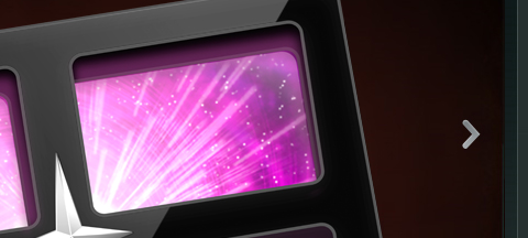
Smallstone, a U.S. record label, presents its navigation menu in the form of a the so-called Space Echo Roland SE-201.

TNVacation
It’s pretty hard to find a nice-looking drop-down menu. This one is a beautiful exception.

Clearleft
Clearleft uses a couple of paper pieces for its navigation.

上一页12 3 下一页 阅读全文
富贵资源网 Design By www.hznty.com
广告合作:本站广告合作请联系QQ:858582 申请时备注:广告合作(否则不回)
免责声明:本站资源来自互联网收集,仅供用于学习和交流,请遵循相关法律法规,本站一切资源不代表本站立场,如有侵权、后门、不妥请联系本站删除!
免责声明:本站资源来自互联网收集,仅供用于学习和交流,请遵循相关法律法规,本站一切资源不代表本站立场,如有侵权、后门、不妥请联系本站删除!
富贵资源网 Design By www.hznty.com
暂无评论...
